Figuring out what colors to wear in your photoshoot is an important part of the whole experience. First, you want your color choice to be consistent with your business branding, and second, it should transmit a message to connect with your potential clients. So, if you’re figuring out what color you should go for, keep reading because, in today’s blog post, we’ll dive deep into what colors you should wear for your brand photoshoot and how to match them to create a perfect balance.
What colors should you wear to your brand photoshoot?
One of my clients’ first questions is what to wear in their branding session. I get it. You want to look your best and present yourself as the best option to your potential clients. If you haven’t already, make sure to download this free guide to give you an answer to this question.

But there’s another factor you should consider, which is color.
Color is a crucial part of your business’s visual identity. Even more important, every color you choose, whether it’s for your business or photoshoot wardrobe, evokes different feelings. For example, yellow usually means bright and radiant; on a marketing level, it communicates that you’re a cheerful and positive person.
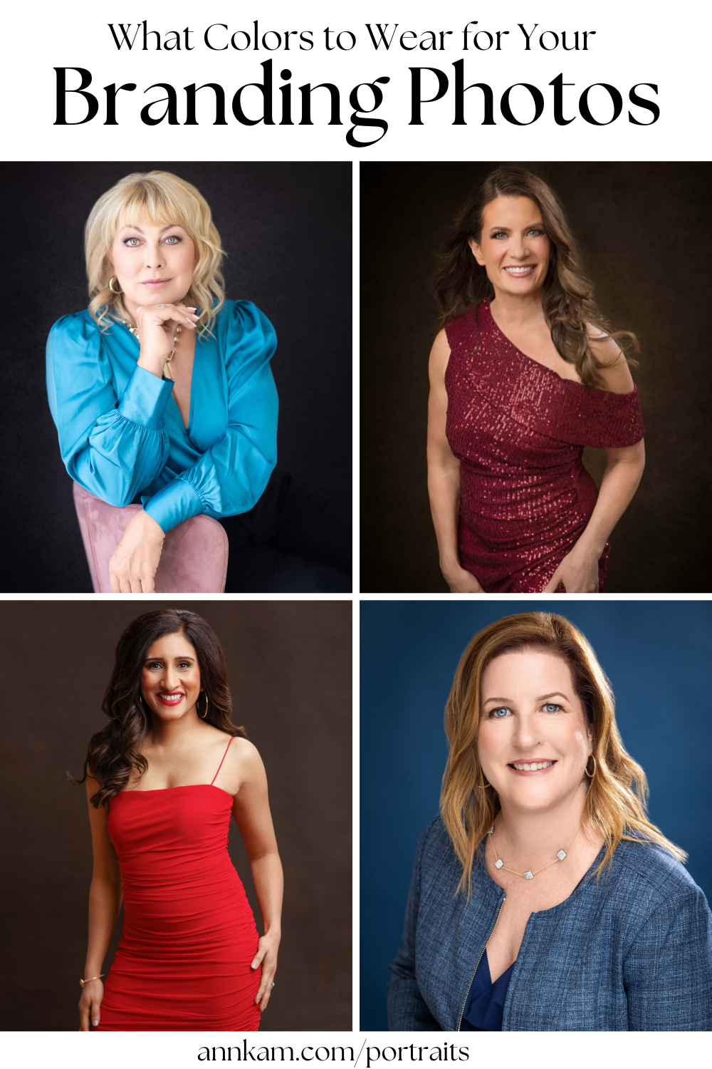
You can incorporate color into your branding images in different ways. The most obvious is to include your brand colors in your clothing, the background, or through props.
Another element to consider is that there’s an emotion and a marketing message behind every color you choose. I thought this was so interesting that I created a color guide with the meaning and marketing uses of different colors:
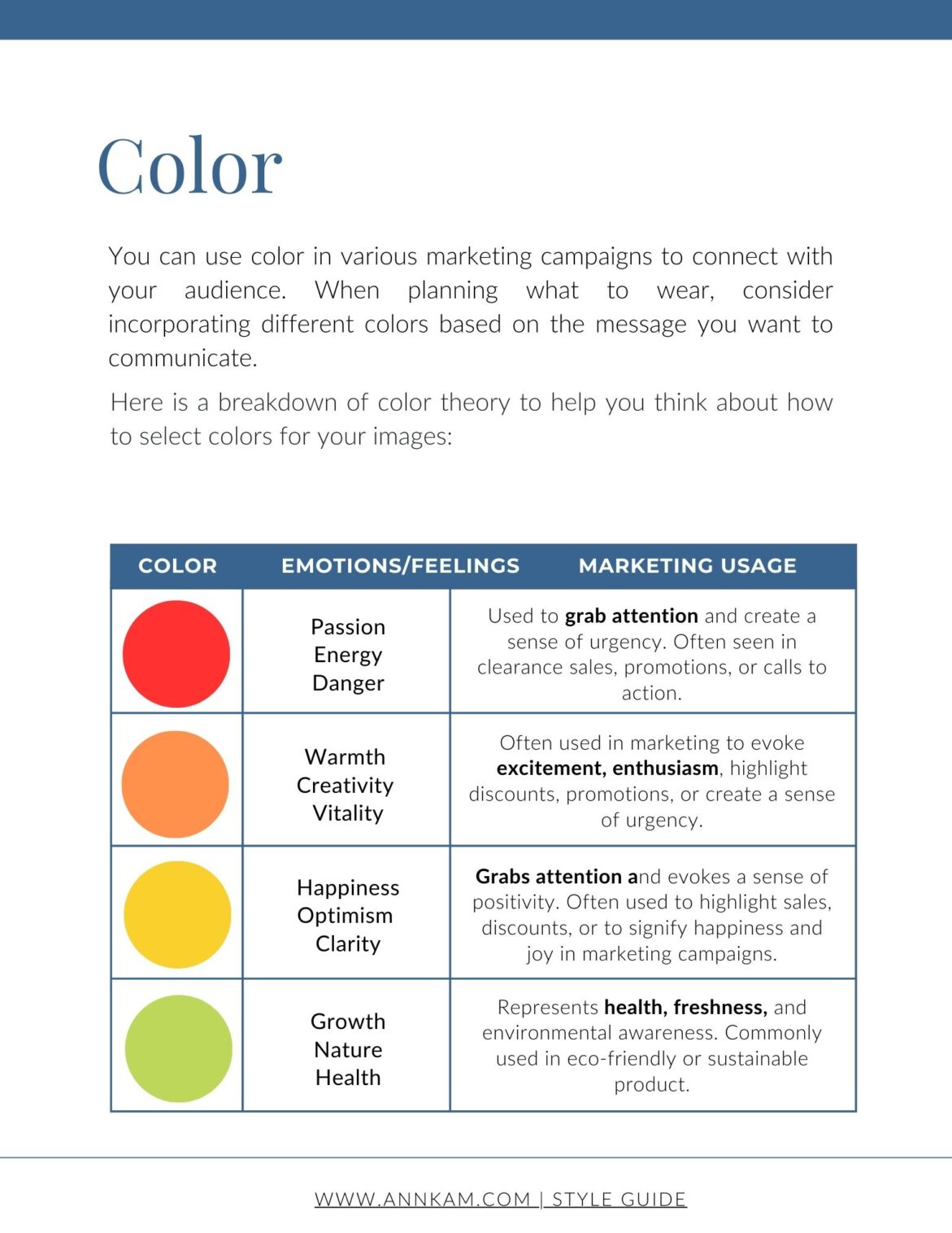
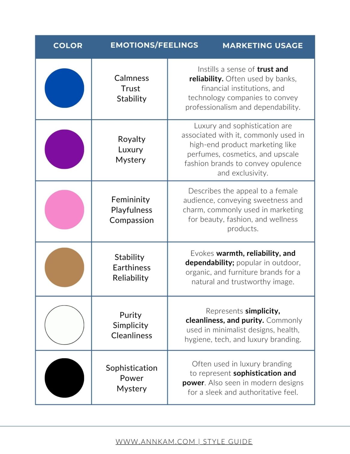
After reviewing this list, I’d like to know which color best reflects your business. Comment below with your answer!
My color choice
After working in weddings for 13 years, most of my dress clothing is black. Of course, the feeling we want to communicate is elegance and sophistication.
Like many women, I feel comfortable in black and enjoy photographing it (especially when it has an interesting texture!), but when I was preparing for my own photoshoot, I wanted to incorporate some color to add interest and make my brand feel a little more fun.
Honestly, we haven’t been consistent with our brand colors as a business, so I didn’t want to limit myself to that. To start, I did some research.
- I first noticed other brands and ads and saw how they made me feel. The emotional part played a huge role in my decision.
- The second thing I did was research the meanings and emotions that colors evoke and how they are used in marketing. When I started considering my feelings, looking for clothing that fit my brand made my marketing way easier.
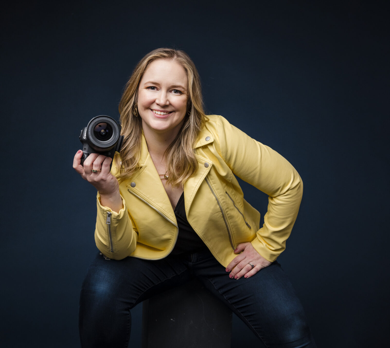
For example, I have never purchased anything yellow in my life—nothing. Ever. But after noticing ad campaigns that included yellow made me feel happy and light and seeing it on my color chart, I went on the search! I found a great yellow leather jacket online at Nordstrom.com and ordered it, as well as a couple of other items to try.
I honestly felt really weird when I tried it on and showed it to Kam and Vivi, but they gave me the thumbs up. We shot it at my next photoshoot and really loved how it looked! I decided to keep it, and you’ll probably see it again in future images. Of course, are welcome to borrow it at your own shoot!
How to use color in your branding sessions.
You can use color in various marketing campaigns to connect with your audience. When planning what to wear, consider incorporating different colors based on the message you want to communicate. We can also include color through backgrounds and props to make your images pop a little more.
For example, Marquita wanted to use her glasses as the popping accent for this session. Look at the effect it creates. It communicates her professionalism, warmth, and charisma as a person. Depending on your personality, feel free to explore colors that match your branding identity. But, as I always like to mention to my clients, go further and step out of your comfort zone to create a wow effect.

Whatever your color or wardrobe choice, the most important thing is to trust and feel confident with your photographer. That’s why I start my process with a consultation call. This call gives us an opportunity to get to know you and your business and guide you through the right choices when it comes to wardrobe and color selection. So, if you’re in the Barrington or Chicago area, reach out to us to discuss the next steps and how to make you look best in your session.
Remember to save this post with this color chart when trying to figure out how to add color to your images and share it with your business friends!
Pin this article here as inspiration for your next session!
comments +